Part 1 - Creating photos of photos
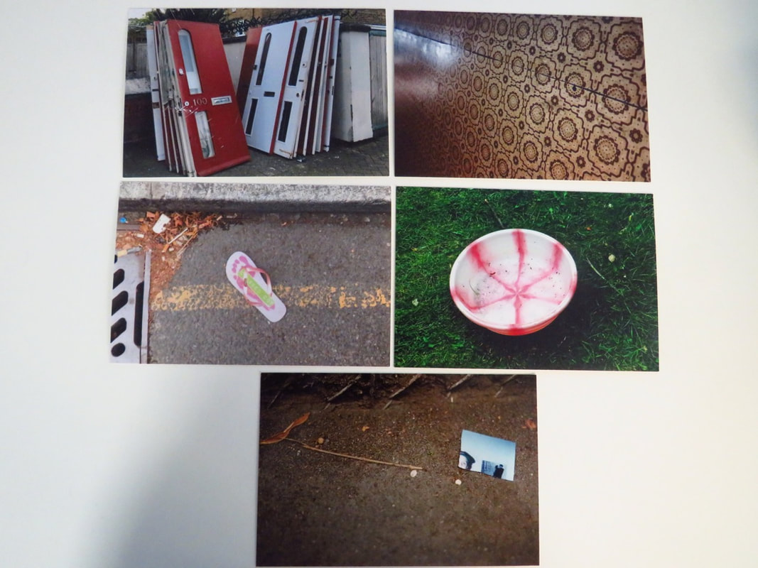
I chose these photos because it looks very different to each other. The first photo is a bunch of doors stacked upon each other. This is very unique and is very abstract because it is something that you will not see consistently every day. The colour differences of the doors makes it stand out and because of the placement of the door. Furthermore, some of the doors are much more used up than the other does which gives it a mashed up texture. The second photo has a beautiful pattern and has a very nice colour scheme which gives the flooring an amazing difference from the rest. Also, the split through the floor give the feeling that the flooring is not perfect and is very worn out. The third photo is very unusual because you wouldn't find a flip-flop in a gutter which gives it a difference from the rest. Also, the change of colour makes it very unusual and very odd. The fourth photo is unlike the rest of the photos because it is very natural except for the bucket which is unnatural. But, it contrasts with the grass because there is a massive colour difference which gives it its distinction. the fifth photo is my favourite because it is set in the night which makes the light shine up the photo on the right hand side which gives it a sense of creepiness.


These photos that I have made depict the photos in a different style . I chose these places to take my photos because they either match what the photo was or the photos are totally different to the surroundings.
Part Two - My Photo-Sculpture


WWW: There is a variety of light sources ranging from my phone to the natural light
WWW: The composition of the photo is very different to each other
WWW: There is a lot of detail in some of the photos
EBI: Too much tape can be seen
EBI: Some of the photos are too blurry
EBI: There are too many dark spots in the final photo
WWW: The composition of the photo is very different to each other
WWW: There is a lot of detail in some of the photos
EBI: Too much tape can be seen
EBI: Some of the photos are too blurry
EBI: There are too many dark spots in the final photo
Part 3 - Photo Analysis
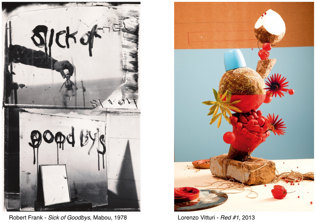
I can see in Robert Frank's photo that there are 2 halves put into 1. In the top half, there is an arm holding a toy skeleton in front of either the sea or a road. the bottom half of the photo consists of a mirror which 'goodbys' written on it in a sort of blood or pain style. There is also a mirror beneath it. In Lorenzo Vitturi's photo, there is a brick holding up a vibrant and tropical selection of different shapes and sizes. The background is very interesting because there isn't a perfect ratio of colour spread . There is much more blue than orange. Also, on the surface there is a disc with string hanging off into the brick. Finally, it looks like there is a sort of plate or coffee lid behind the brick.
A similarity between both photos is that they are both very abstract, mysterious and gloomy. You can see this because you don't really know what these photos are really trying to portray. Another similarity is that they are sort of cut up into different parts of the photo because there are 2 different parts of the photo in Robert Frank's photo and 3 different parts in Lorenzo Vitturi's photo. In contrast, a difference is that the light source is very distinct because Robert Frank's photo uses natural light but Lorenzo Vitturi's photo uses light from bulbs, phone lights and many other things.
You can see many edges. In Robert Frank's photo, in the top half, there are edges on. the arm, the toy skeleton, the writing, the landscape and even just the mirror. In the bottom half, you can see edges of a mirror, a shadow, writing, wood and the colour switch. In Lorenzo Vitturi's photo, there is an edge on the coconut, background, cup, chilli peppers, flowers, bricks, discs, string, red baubles, plants and also the surface. These photos help me put together photography and edges by observing 3 dimensional shapes through the natural eye and if I take a photo, it becomes 2 dimensional.
