When I think about landscape, I think about the view of natural scenery, thriving plants and beautiful mountainsides. The first 15 words that come to mind when thinking about landscapes are:
Scenery, Mountains, Happiness, Aesthetically Pleasing, Tropical, Paintings, Skylines, Colour, Images, Calmness, Trees, Countryside, Relaxing, Broad, Appealing.
A google definition for landscape is:
'All the visible features of an area of land, often considered in terms of their aesthetic appeal.'
My ideal landscape photo would be of would be of a high-resolution photo with a beautiful mountain brightened up with many vivid colours. Looking out of my classroom window, I cannot see very much as there is a massive dreary building blocking the landscape. To my left, I can see patches of green grass with a rusty fence inside of a deep ditch. To my right, I can see buildings stacked upon each other with a bridge passing through the empty space in front of the buildings. Looking up, i can see a dark grey cloud pass upon us.
When searching for images on Google, the majority of them are of colourful mountains and perfect, blue lakes and rivers like shown in the photos below. (Google images)


|
This Mindmap that I have made about landscape consists of 4 main ideas, Nature, Themes, Perspective and Emotions. There are many themes within landscapes but the most notable are of: Nature, Urban, Domestic and Edited. Urban is all about the cities around the world, the highly built up skyscrapers, the paving on the sides of the road, the graffiti on walls in run-down areas, and the lampposts which travel with us everywhere we go. Domestic landscaping is about taking photos around a house or outside of one. It could be of some furniture, the rooms in general, the walls and the texture of them, it could even be about the paintings or images around the house if there is. Nature is probably the biggest idea in landscape for me because the scenery outside, such as the trees, grass and the mountains. The trees consist of the leaves and timber. The leaves are usually vibrant, luscious and neon green, but in the autumn, the leaves are very dreary and crumpled. The timber is always very blocky, muddy and chunky. With the grass it could be either very long or cut down and short. The long grass is a sign of life, very colourful and nutritious, however, the shorter grass can tell us that there are remains and is cut down. With mountains, they can be wide, large and can link with the previous idea of nature. The mountain could be oversized, dangerous, but could be beautiful.
|

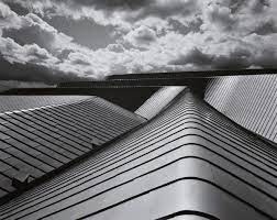
Lucien Hervé

|
Lucien Hervé is a Hungarian photographer who is widely known for being a top quality architectural photographer, creating most of his work with Le Corbusier. His work is very similar to Helene Binet's work, using the black and white filter to give the image a more bleak tone, however, I feel as if there is a distinct nature to Helene Binet's work. It looks like Hervé has incorporated a more urban feel, but to me, I feel a more dystopic vibe from this. The way he manipulates the shadows, sort of shows me a mysterious background to this photo. The scenery reminds me of somewhere like Shoreditch, in East London, in a dark, poorly-lit car park. This photo stands more out to me then Helene Binet's work because Helene Binet doesn't have a certain theme to base her work off, but Lucien Hervé has a more urban theme to follow.
|
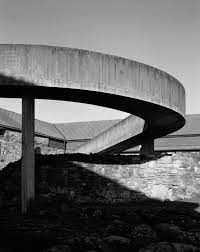
Response to Lucien Hervé
|
To start off with my response to Lucien Hervé's photograph, I had to find a location to take the image from; going to Wembley Stadium and taking an image of the infamous ring isn't a bad idea. This image is quite a personal one to me because it is the first time I have ever been to Wembley and it was one of my dreams to be inside of Wembley. Afterwards, I had to change the tone and filter of the image, so I went onto photoshop and changed the filter into black and white. Something good about my image is that the positioning of the image is perfect, with the blurriness from the fast cars to the alignment of the buildings, leading us to Wembley Stadium, almost like statues on either side, leading us to the throne, the Crown Jewels, the treasure. however, something that doesn't appeal to me is that the darkness doesn't really match with Lucien Hervé's work. Also, the theme is a little bit different, with his seeming much more underground, compared to mine which is very outside. overall, my final outcome is quite poor compared to Lucien Hervé's work and my intentions to replicate this work is quite disappointing personally.
|

|
Helene Binet
|
|
Helene Binet is a Swiss-French photographer who uses a black and white filter to take images, giving a more monochromatic tone to the images, because if the image had it's normal filter, the photo would look very bland and very boring. One thing that I like about this filter is that the distinction between the colours makes the image quite unique, further emphasising the two-toned nature of this image. Furthermore, it is almost as if you can also feel the texture of the surfacing, the gritty feeling of the bridge in the right image, the smooth feeling of the surface in the left image, it could make the viewer feel as if they are within that image, which makes this image feel so special and very different from any other image.
|
Dafna Talmor


Dafna Talmor is an artist based in London who creates collages using different photos by cutting them out and using the edges to create a collage which compliments each other. Her photographs are included in public collections such as the Victoria and Albert Museum, Deutsche Bank, Hiscox and in private collections internationally. In her exhibition 'Constructed Landscapes: Volume III' (Shown Above) she explores the use of a single image, she finely cuts into the paper using a scalpel, and rearranges it so that the image has changed but is still the same.
Charles Wilkin
|
|
Charles Wilkin's work is a loose collection of thoughts and observations in many ways and less about one specific theme. he sees it as reflecting the world that we all live in, with all its ugliness and cruelty. For him, collage as a medium replicates this hectic and essential collision of people, culture and emotions we all experience. This work to the left have been created by Charles Wilkin as part of his 'Proof' series. They are images of various landscapes which have been hidden or obscured by bright colours. In my opinion, the images are very obscure in some ways. I see it as obscure because the colors are quite contrasting and the texture is very different. Also, the material used makes the work more interesting because this theme of photography is very unique, and the composition of the material is very unusual. These multi coloured shapes are reminiscent of fabrics that are solid and silky. They overlap each other to make it look like the fabric is falling out of the image. The top left image looks like rubbish has been thrown onto a destroyed, dilapidated, urban city. The glowing colours of the fabric makes them contradict the dull grey rubble piled upon one another. The image in the top right looks like aging antique has been painted on with a glossy paint to counter the old, crackled vases and plates. My favorite picture of the four is the the picture in the top left because the way that he placed the material on the photo almost makes the viewer envision the material flowing out of the wall, like a waterfall. My least favourite photo is the photo in the bottom left. I have said this because it almost seems that the material is placed randomly and the image seems awkward.
|


Response to Charles Wilkin
|
In my opinion, my response to Charles Wilkins' art is although nowhere near Charles Wilkins' standard, I feel like I did a good job at that point in time, however, I could've tried to fill up the page with more contrasting colors, like a vibrant blue, or an emerald green. A positive aspect of my work is that the way that I composed my work was of a high standard, cutting and refining the piece of paper to fit he page, following the guidelines of the marbling of the shiny rock, shaping the photo in a way where it looks as if the the paper is spiraling out of control. However, there are a few things I could've done to improve this work. One improvement I could've made was filling up the page with more vivid colors, as I mentioned before. Another improvement I could've made was to not make the image as blocky because it seems as if the image is made out of geometrical shapes, like squares or triangles.
|

|
Corinne Vionnet
Corinne Vionnet is based in Vevey, Switzerland. Her works includes extensive research, photographic image making, the appropriation of crowd-source material and collage. She takes thousands of snapshots and combines them all together to create one large image. The bluriness combines together and creates a screen, a blockage between the viewer and the actual picture itself. Iconic landmarks seem to be a main theme for Corinne Vionnet, using certain landmarks such as the Eiffel Tower, The Houses Of Parliament, Golden Gate Bridge, Taj Mahal , The Colosseum of Rome and many more. Her snapshots are mostly her own, however she uses some tourist photos to combine with her photos. The outcome looks like a painting from the 18th century, which amazes me.

|
This image is of the Colosseum in Rome. The image looks very erratic and pixelated. The image is of a murky, yellow, dilapidated hole, shaped like a dome. The blurriness of the image gives a sort of secretive and unknown vision of the work itself. Also, the blurriness of the image makes the viewer question what they're seeing; is the image a painting or a photo. In my opinion, this piece of work is one of my favorite pieces of work to see because the photo is aesthetically appealing and the work in this theme is very unique and seems as if it has never been done before. Furthermore, the actual prestige and how famous the landmark is makes this piece of work so much better.
|
Analysis of images


My favourite image is the image with rain on a window. I think its my favourite because of how clean the front of the picture is and the blurriness of the background. It just seems aesthetically pleasing. The colour changes with the patchiness of the ground, the green colours of the grass and trees, the greyness of the pavement and the sky and the blue background of the allotment. An improvement that I could've done is that I could have tried to incorporate the background much more to make the photo much cleaner.
Analysis of the images


In my opinion, I like some of the images because the images are set up within the theme I wanted to take photos of. My favorite image that I took was of the close up of the grass. This was my favorite photo because I managed to get low enough to take a perfect photo, with my ideal focus point being the grass, and the bushes blending in to make the background. Also the image just seems very focused and sharp, the strands of grass having its own unique feature, with some browner strands and some more luscious green strands, with the perfect sharpness of the image. Another image I particularly like was the third image with the berry. I particularly like this one because it is vey similar to the close up of the grass, I had caught the focal point perfectly, with the berry, and the leaves which are out of focus accompany the berry itself. Something which makes the photo better is that I managed to catch the lighting of the sun at a perfect time, reflecting off the berries, making it look like a shining jewel, a burning hot star.
At home, I decided to reconcile many images to fit the work we were trying to do. These images are a mix of older photos and much newer photos. These are the best images. The best image was of the mountains because while we were on holiday, I had to climb up a rock that is around 20-25 feet high, but it was a risk I was willing to take, which ended up paying off massively. There is also a backstory to this image that just makes this image so memorable. I went to this rock with my family and it was steaming outside. We walked up a hill for 25 minutes straight until we got to the top of the mountain. We took many photos with each other and we took in the view. That day was so memorable because there was my family, with my cousins, aunts and uncles and we gathered up with each other so nicely. However, my worst image was of the butterfly, because the image wasn't focused and it wasnt captured correctly, even though the image had a good backstory.


Awoiska Van Der Molen
Awoiska Van Der Molen is a Dutch visual artist born in 1972. She creates abstract black and white images using nature. She anonymizes her images to make viewers look at the image from aesthetics rather than the viewers looking at the location it was taken in. She uses places that are very sentimental towards her and that hold great value towards herself. Awoiska Van Der Molen is known for her monochrome landscapes. Her dreamy atmospheres coloured with a monochromatic tone


Luke Saxon
Luke Saxon is a photographer based in Rochdale, England. Saxon often takes images in urban landscapes such as small towns and large cities. He takes images of people, buildings and nature, using the colour to create quirky compositions. From one of his albums, True North, he takes images that relate to his childhood and images that are close to his heart. For example, He took an image of a kebab shop. He took an image because it symbolises a part of his childhood. He also creates collages with photos that he has taken. He sort of blends them in together with very separate images. For example, he took two separate images of the front of a house and overlapped the image to make it look like the bush carries on across the whole page. In my opinion, I like some of the images because it appeals to me. However, he says in his bio that he includes many ethnicities but he has only includes two different ethnicities.


In my opinion, Saxon's collages are his best creations because he uses many different images to create one collection of two totally different images. However, I have a mixed opinion on his images relating to his childhood because I like the reason that he takes his photo. He takes these images because of the fact that there is a backstory to his photos. However, his photos are very bizarre and I don't really understand his reasoning for taking these images.


Distorted Images


I wanted to take some images around the school and I used a plastic sheet to cover the lens of the camera. I tried to navigate around, finding images that pleases me, or finding images that compliment each other. I liked some of the images because the blurriness looks so much better, however, it throws me off. The best image was the 10th image. This image is my favourite because the landscape is very clear and there is minimal urban landscape. Also, the blurriness of the camera blends with the actual landscape very well. However, the image that I like least is the 7th image. Personally, I have not kept the camera still, there wasn't a main focus in the image, the actual image was out of focus and the fogginess of the camera is very off-putting. Overall, I did not like this style of photography because I like to have an image which is very vibrant, vivid and also which contrasts everything around it. Also, I would be better if the images were more sleek.


I took these images around the area in which I live. I wanted a visual storyboard of the area. These places all have particular places in my heart as I grew up here. I decided that the urban landscapes theme as when I travel around my local area initially I think that there isn't much to see but when I walk and look again, through the eyes of my camera I started too see images that looked quite abstract, such as the images below I see. Also, urban landscapes are much more appealing to me because I see urban landscapes every day and I feel a personal connection to the landscape. My favourite image is the image with graffiti all over the walls. This is my favourite because all of the contrasting colours of the spray paint and the patterns of the spray painting, it all comes together in the end. My worst image is the image with the bus in it. It was too blurry and it was way too zoomed in. To improve this image, I could try and take an image on the ground and try to focus on one single object rather than a multitude of objects or focuses.
|
This photograph is a brilliant example of things that I have seen differently when looking through the camera. In this image I can see that the light and shadows have created a series of different shapes. It made me then look into greater detail at how there is a large contrast between the brightness of the light, compared to the more gloomy and darker tone of the shadow. Also, the distorted, bent, corrugated iron bars with the sharp, zippy barbed wire provides an element of surprise, making the image look more old.
|

|
Using the images I took from the digital collage and previous image analysis, I created a collage with the images. Firstly, I took the image of a tree and traced around it using a pencil and ruler. After, I cut out the tree using a scalpel. After cutting out the tree, I used other images in the background, replacing the tree. I did the same thing with the fence, the bush and the compound. With these cutouts, I sticked it down onto other pieces of paper, wherever the image compliments it.
I believe that if I used different themes such as urban landscaping, it would change the perspective and the contrasting between nature and urban. This could completely change how the image is visualised and could literally be a different change.
I think that I could maybe photocopy on acetate paper or to make the images a double negative to experiment with the outcome of this project. I think that if I double negative the photo or photocopy onto acetate paper, I can see lots of free flowing patterns whilst seeing the basic image clearly with a black and white image colour. Maybe If I go into a pitch black area, and I take a photo with light reflecting the image, I could get a very clean image.


WWW: The outcome was very good, the simple collage formation accompanied all the photos together.
EBI: Use other landscape themes such as urban landscapes.
EBI: Use other landscape themes such as urban landscapes.
|
In my opinion, the work I created was great; although simple, it was very effective. The simple collage formation looks very good and all the photos accompany each other. However, I think that I can add other themes such as urban landscape or within my house. To boost the originality and how different it looks, using multiple themes together could make the quality of my project much, much easier. My image looks like a bunch of different colours coming together to create a colour burst. Some of the photos I created looked very realistic and one of the images looks like a proper bush. My favourite image is the one with the tree and the red and blue photocopied bush behind. It is my favourite image because it is the most abstract image I have and the colour contrast is the most investing and intriguing thing about my image. My least favourite image is the image of a bush with grass inside. I do not like this image because the image is very unoriginal and it looks very boring. from this work of art. From this project, I learnt that I can show my creativity very well and that I should trust my own instincts and do whatever I think is necessary to do.
|
|

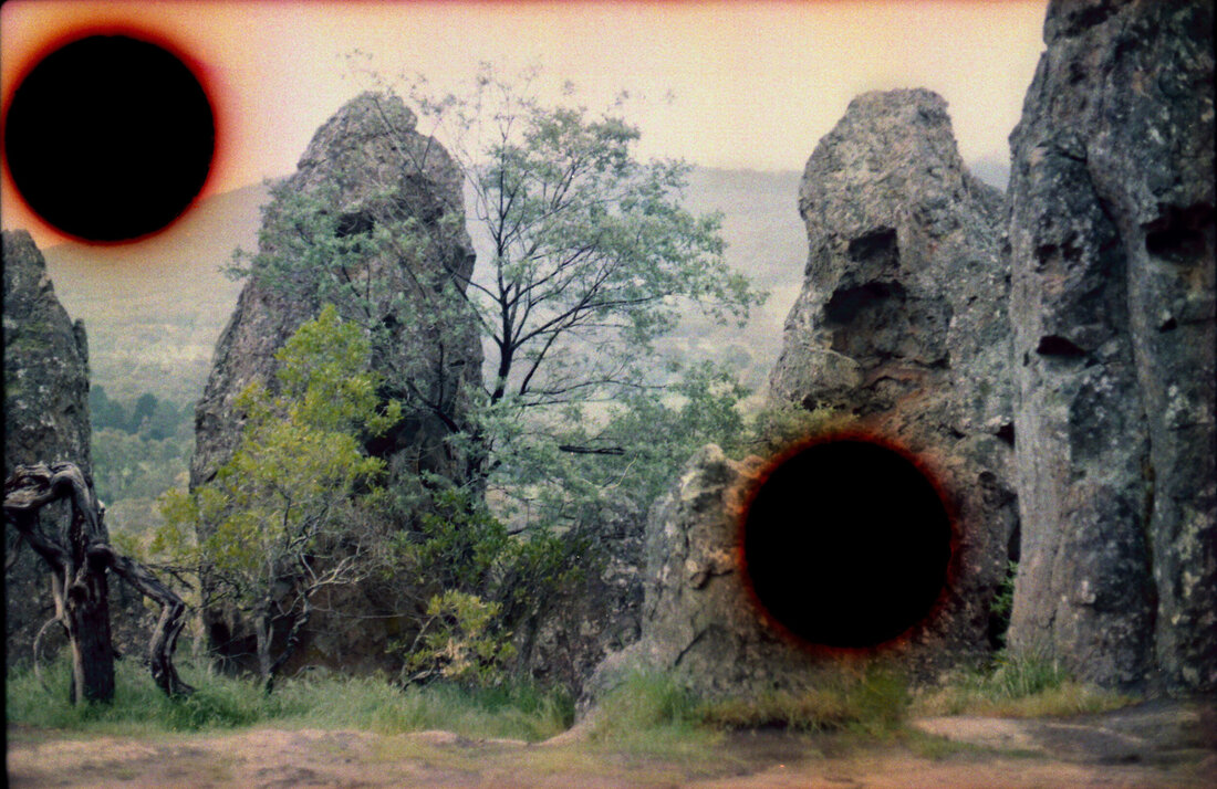
Alice Duncan
Alice Duncan is a photographer who practice exposes the constructed nature of our personal and cultural identities. Utilising photography, ready made materials and site specific installation, She creates images that layer both past and present Australian histories, using a combination of past and present photographic techniques. Her work almost imitates the indigenous people and the simplicity of their lives, with this work also simple and very enticing, as this photo catches your eye instantly.
|
Something that makes me question this work is that I don't understand how Alice Duncan managed to obtain the orange colours around the incisions and scars of the black circle. Zooming in on the background, the very dim colours with some very unclear colour contrasts, it makes it look like a 1980's film. Looking at the focus of the image, you can clearly see a patchy tree with crumbly rocks sitting behind, leaning on one another, surrounded by patches of nothingness with shades of orange surrounding the black hole looking shape. In my opinion, this piece of work takes my eye because the unusuality of the image with the dark circles surrounded by a weird orange circumference across a beautiful landscape. She managed to acquire these unnatural shapes by manipulating and scarring the analogue film. It seems like a very tough process to undergo, but I think that it can be worth it if executed properly.
|
Lorenzo Vitturi
Lorenzo Vitturi is a photographer and sculptor based in London. Formerly a cinema set painter, Vitturi has brought this experience into his photographic practice, which revolves around site-specific interventions at the intersection of photography, sculpture and performance. In Vitturi’s process, photography in conceived as a space of transformation, where different things merge together to represent the complexities of changing urban environments. Vitturi’s solo exhibitions have taken place at FOAM Museum in Amsterdam, The Photographers’ Gallery in London, at Contact Photography Festival in Toronto, and at the CNA in Luxembourg. Vitturi also participated to group exhibitions at MaXXI in Rome, at Centre Georges Pompidou in Paris, at La Triennale in Milan, at the Shanghai Art Museum, at K11 Art Space in Shanghai, and at BOZAR in Brussels.

|
This image is from one of Lorenzo Vitturi's project called 'Anthropocene'; Anthropocene means 'relating to or denoting the current geological age, viewed as the period during which human activity has been the dominant influence on climate and the environment.' - Google Definition. The image itself doesn't have a name. This image has plenty of red leaves, sort of like small branches off shrubs. The red, sandy texture contradicts the flaky, pristine leaves. The image reminds me of life on mars, the red sand, the crimson shrubs, the black and red mountains with the rocky seedings. The close up of the image is very calming and visually appealing. It just works together and how the colours come together very nicely. The lighting is coming from the top left of the image, the light rebounds off a dirty, sort of tarpaulin. The light then centralises and moves towards the focus of the image. The focus of the image is the leaves right in front of the tarpaulin, the miniature rocks with the soft, sand texture compared to the gritty, grey rocks. In my opinion, this work is intriguing because the context, the meaning and the originality of the image is very powerful to me.
|
Joe Rudko

|
This image is from one for Joe Rudko's projects called 'Untitled Colors', with its own name, 'Green'. This work is based off Joe Rudko's own snapshots from his own family, friends and random screenshots and photos he found online. He used photoshop to change the original colour of the photo to different shades of a green, creating a gradient, consisting of a darker, more emerald green colour at the top, moving to a more lime green and a more yellow texture opposite. In my opinion, this work is one of my most favourite styles of making products because the gradient is appealing to me, also the sudden colour shift is very unique. However, one deficit to it is that it requires lots of images and the images need to have a perfect filter to match the original image.
|
Constructed Landscapes
|
For Making Day, I wanted to try something different. I based my work off gridding, and Corinne Silva's project 'Garden State'. The arrangement and randomness of the images interests me, however, I used a different formation and I had placed it on the wall next to the staircase. The pictures are also placed randomly, compared to Corrine Silva's more organised approach to this gallery. It also makes me feel very calm as it is a very simple, but effective piece of work, it won't stress me out if anything goes wrong and the project can make me enjoy taking images and letting me arrange them however I want to.
|

|
|
|
The first step is to take some images of a surrounding area. I took an image of anything that took interest to me. For example, I took an image of a science chair inside of a white box. All 15 images and more have all been random and all just picked because they're all very divergent. Afterwards, I wanted to filter some of the images, making them black and white, double exposing them, colouring it differently or just keeping it the same. I think that the images that were pure in the beginning were very good for the most part, but editing and refining the image made the images much better and more unique. After, I printed the images, I added blue tack to the images and took images of them in a group. After, I tried to find a place to take the images. Finding the place to take an image is very tough as there wasn't many places to find and place around 15 images. At first, I Tried to put it on a wall outside, but it was too windy to place it outside, then I tried on a window, but it was too small, and finally, I had the idea to place it on the wall next to the staircase. The plan had worked and I placed the images on the wall, considering how far away one image is away from the others. I tried to make it very aligned, with some photos removed and placed elsewhere, thats how I got the gapped pattern. Personally, it turned out very well because
|


Final Outcome
|
My final product was very strong in my opinion because the pattern and the formation of the images are very appealing and the creativity of levelling it out on a slope makes the background of the images much more interesting. One thing I would improve about the image is that I would frame these images up or I would put it onto multiple A4 canvas' to add a more blocky texture and show more of the image and its quality. Another thing I would improve is that I would space the images out more, providing the images more space and giving the image a larger limelight for that certain image. Overall, I believe that it is one of my best pieces of work because of how simple the gallery was to assemble, photograph and to edit. Furthermore, It was very soothing and chill, because I didn't really stress out and it felt fun to do.
|
|


The Agoraphobic Traveller
|
|
The Agoraphobic Traveller, also known as Jacqui Kenny, is a street art photographer who suffers from agoraphobia. Agoraphobia is: 'extreme or irrational fear of entering open or crowded places, of leaving one's own home, or of being in places from which escape is difficult.' - Google Definition. Essentially, she is scared of going outside due to many different reasons such as trauma. Her work is very inspiring to me because I can sort of relate to her situation, being locked in my house due to COVID and taking images using google earth. In my opinion, her work seems very simple, but it is very contrary, compared to other photographers and their perceptions of photography and the definition of it. She quoted, "I found a surprising and unique refuge in the creative possibilities of Google Street View. I began clicking through Google Maps to navigate to faraway countries like Mongolia, Senegal, and Chile. I found remote towns and dusty landscapes, vibrant architectural gems, and anonymous people, all frozen in time. I was intrigued by the strange and expansive parallel universe of Street View, and took screen shots to capture and preserve its hidden, magical realms."
|


My Response To The Agoraphobic Traveller's work
|
My process of thought when finding my images was to first, use Google Earth, rather than Google Maps, because the images are much more sleeker and is more in focus than Google Maps. After, I had to find a theme to use for this response. I was torn between finding images related to urban landscapes and exploring mountainous regions. I ended up choosing the mountainous theme because I believe that there is a vibrancy and difference within every image, whereas an urban landscape is much more visible and is seen on a day-to-day basis by most people. I decided to be more selective, choosing the images that are up to a high standard. Some of these images are quite personal to me, because some are where my family have originated and have lived for many generations. Some of the other images was of rocky landscapes within the west of Europe, in places such as Spain. My favourite image was of the image of the river because the image is personal to me, and the colour translations are very appealing, with the lighter green, to a clear, translucent river.
|
|


Collaborative Collage
With another student, I did a new project, following these steps:
- Cut or tear out 5 pages from your magazine. Choose pages with interesting images.
- Make a pile of these 5 pages on your desk.
- Take the top page and cut a hole in it (Note: it doesn't have to be perfect).
- Pass this cut out image to your neighbour (the person sitting nearest to you in class).
- Put the page with the hole in it at the bottom of your pile.
- Take the (new) top page and tear it in half. Pass one half to your neighbour (the same one as before) and put the other half at the bottom of your pile.
- Take the (new) top page and cut out a shape (Note: you could cut round an object or simply cut a random shape of your own choosing).
- Keep the cut-out shape, putting it at the bottom of your pile, and pass the page that remains to someone 3 places away (Note: make sure you don't end up with your own page).
- Take the (new) top page and tear a strip from the (top or bottom) edge. Keep the strip and pass the remaining page to someone else in the room.
- Place the A3 sheet of cartridge paper in front of you (portrait format).
- Without altering them, arrange the pieces of paper from your pile on the A3 sheet to create a pleasing collage. Carefully photograph your first arrangement.
- Again, without altering them, repeat this process, re-arranging the various elements on the A3 sheet until you are happy with the results. Photograph carefully.
- You may now swap 1 or 2 elements with your neighbour. Make a new arrangement and photograph carefully.
- You may now adapt the pieces in any way you like - cutting, tearing etc. Make a new collage, this time sticking them to the A3 sheet of cartridge paper.
- Photograph your finished collage carefully.

While following these steps, I had to make sure of some key things to do. I needed to:
Make sure that no cartridge paper can be seen, Let no paper overlap the cartridge paper, be creative and try different themes, like going abstract, or making it similar.
With this method, my result came out like this. In my personal opinion, the outcome is very nice because this is something that I have never done before, its a new experience for me and I certainly enjoyed it, also with making do with the items in front of me given by another person next to me. In that point when I was arranging the images the first time around, it was very tough to arrange, because we weren't allowed to cut or trim the images in any way, shape or form, because we had to stick to the steps and activity. Once we were allowed to trim and cut around the work, it became much easier for me, because it let me be as creative as I want to be, using different shapes, sizes and colours. Once I had stuck down my final work, I put my work into a photocopier, colouring it red at first. After it comes out red, I used the paper to flip the colour into blue, giving the photo an inversed theme. I think the photo came out good because the way that it looks like the image is mirroring itself makes it very intriguing and very questioning.


Sustainable Darkroom Workshop
|
|
We did a workshop by using natural things to create a stunning image. This type of work is supposed to imitate the work that can be done in a dark room, using two colours, black and white. This project aims to create photographs while developing an environmentally friendly photographic darkroom. We need to consider a sustainable darkroom now because with a developing world, we need to develop ways of taking photos, and a sustainable darkroom creates a new style of photography. Sustainable photography may now be used more widely as developers may be too expensive, or a lack of supply, or even to just reduce their carbon footprint by using nature. The process was although tough, it was a very new and refreshing experience. To start, we went out and foraged for natural items, like leaves, branches and grass. After, we went and we cooked up a solution of rosemary, rock salts and warm water. After cooking it, we let it cool down for an hour and after, we used it with something like suncream or vinegar to cover the slide. We had placed the leaves and grass onto the slide and covered with some developer. After, we wait for the image to develop and the final image will come out. An advantage for using this method is that this concoction that we used as a developer is eco-friendly and very safe for the environment. In my personal opinion, I don't like the final product because there isn't much of a final product, and the final product is very random, with a lack of direction.
|


Slides
|
We created some slides with photos given to us. There was free will with these types of images as we could do anything we wanted to do. For example, we could cut the image, re-stick it, we could colour it with felt tip pens or we could use a translucent colour backdrop. The process I used was at first, I had to remove the two other ones in my border so I can put a yellow colour backdrop. I tried to use a purple backdrop but it was too dark and you couldn't see the image. After, I used a scalpel to make some incisions on the slide itself, slicing branches and tearing houses. After, I colored in the photo with some markers, some green to make the photo very similar, and then used some purple pen to contrast the colors. Something that wasn't very helpful is that The colors didn't show very well and it looks like that there was no colour placed onto the film. I also used some sellotape to give a more bubbly texture. A final thing I did was that I used a scalpel to scratch some of the image , to make some of the image clear and to give a different texture to the film.
|
|


Making Day - Response 1
|
|
I decided for one of my projects, I wanted to manipulate the shadows and create a piece of art, overlaying different pieces of the photo, while changing the shape and the colour. After, I layered the shape on top, making it look like the initial photo, with a sort of colour splurge, releasing many different colours, while keeping the same picture structure. I took inspiration from Helene Binet, with the filters and from Alice Duncan with the shapes and the colours.
To start with the images, I had to take photos with shadows in them. A certain theme that I had chose was utilising the nature around me, so for example, using the shadow of a tree, a bush, the building etc... With that idea in mind, I took images of 2 trees, a basketball hoop and a bridge. After, I separately placed the images on photoshop and cut out different shapes, colouring them and placing it above the main image, making sure that I place it directly above the original place. For the most part, the positioning actually worked, however some of the images, like the image in the bottom right, sadly hasn't positioned itself. |


My favourite image is of the image in the top left because all the colours are very distinct and the placement of the images match the original image. I inverted the original image and I put a blue filter on top of the image to give a more wintry, bitter, colder tone. After, I cut out random shapes and laid them above the original photo with photoshop, using different shapes and sizes. Then, I filtered the cut out images using different filters and tones. Furthermore, I then collaged it into one whole piece of work. I did this three times, using all final products, making sure that I used all the final products and placed them above one another, layering it step by step. my final product actually turned out quite well, considering the fact that I had messed up the structuring of some of the photos. The way that I had placed the colours onto the paper was very interesting to experiment and to play around with, the filtering of the shapes giving a very unnatural look and feeling. One thing I could've done to make it better is that I could've used more contrasting colours to make the image more unique and unnatural.


|
|
|


This is my final product. In my mind, I wanted to create two different outcomes, one in the light, one in the dark. Both settings turned out very well, and is one of my favourite pieces of work. To create this work, I had to set up the scene. I put a white backdrop to reflect the light. After, I placed a painted white box in the middle of the backdrop. Now I had the setup. I put the images into a frame and put them onto the white box. I then played around with the light to create different styles and results of images.
|
My favourite image of the light image was of the image to the right. This is because the image looks like it lights up from behind. Also, the formation and the composition of the image make it feel as if it is being exhibited in a museum. Another positive is that it clearly looks as if the image is taking centre stage, the focus point is clearly the images. One final positive is that it looks convincingly like its in the dark even though there is a bit of camera manipulation, making the image feel in the dark, even though its in the bright light. Something that I could improve is that I could try and make the images more visible, rather then the darkness overshadowing the image.
|

|

|
This image is my favourite image that I made in the dark. One reason why is that
|
